Work
What We Craft?
Ui/Ux & Graphics Design
Rebranding Of Jewel Say
Brand Identity
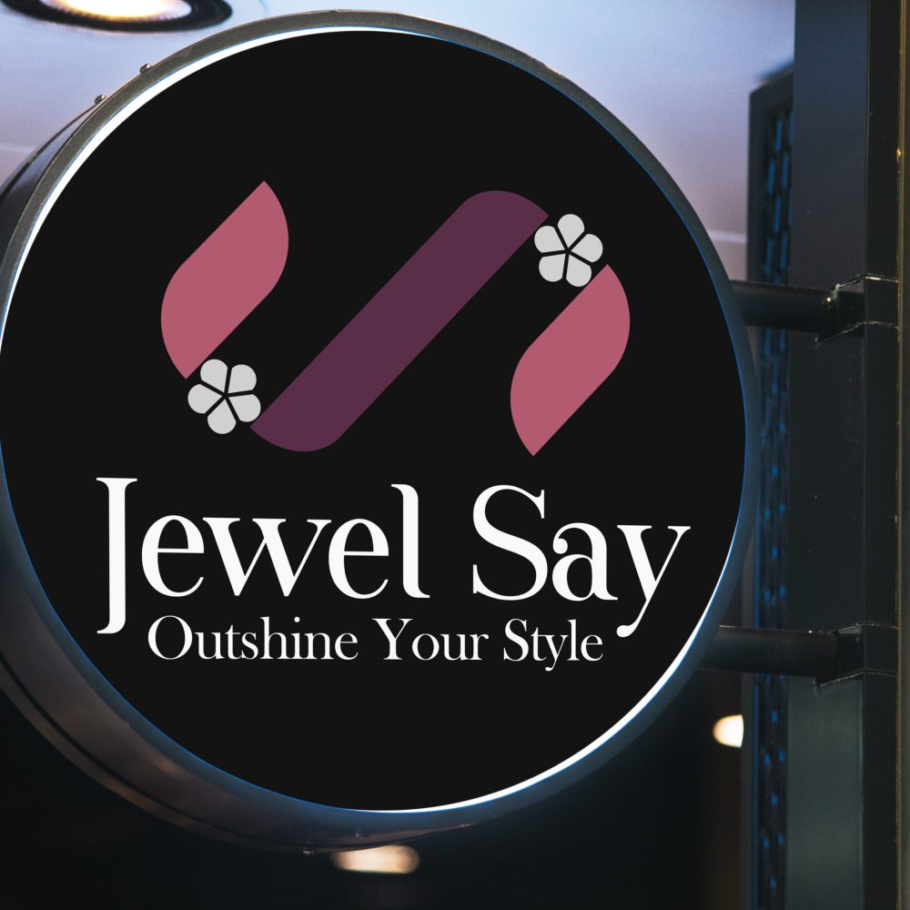
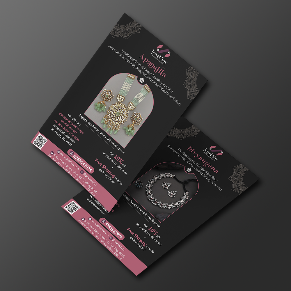
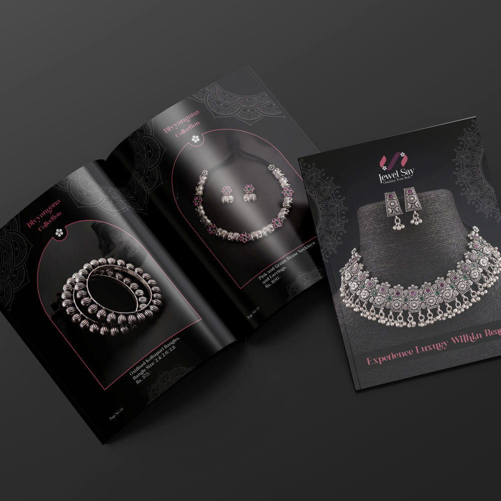
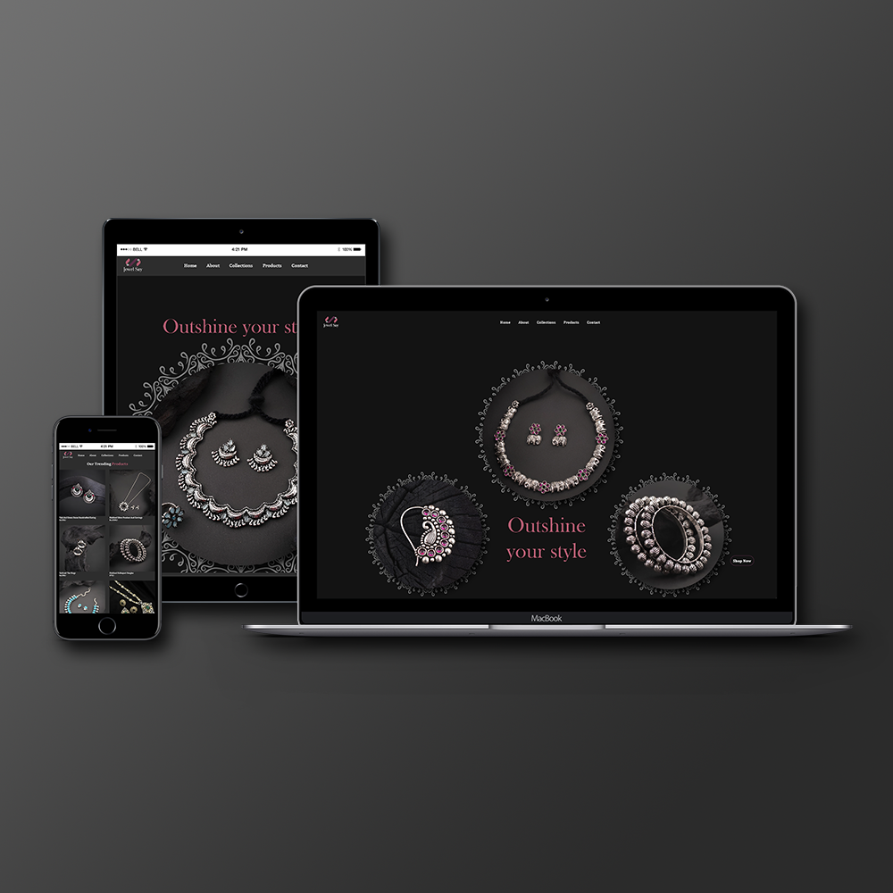
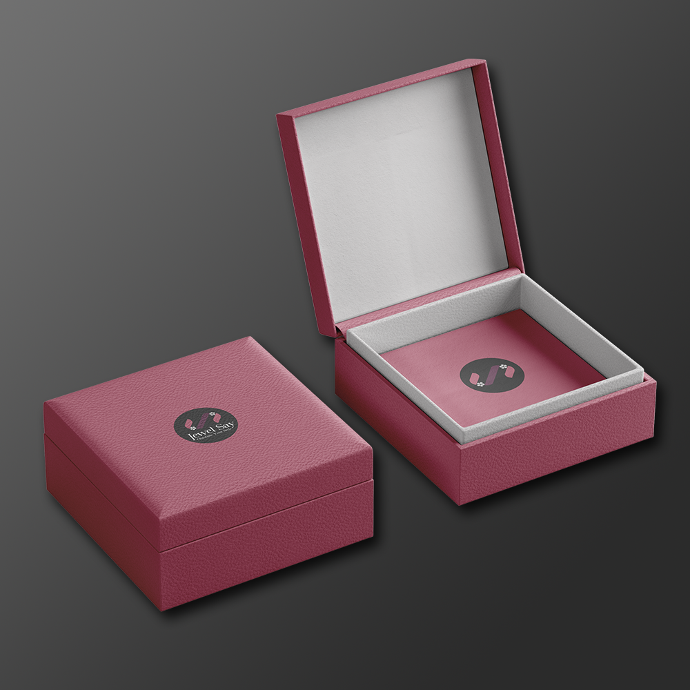
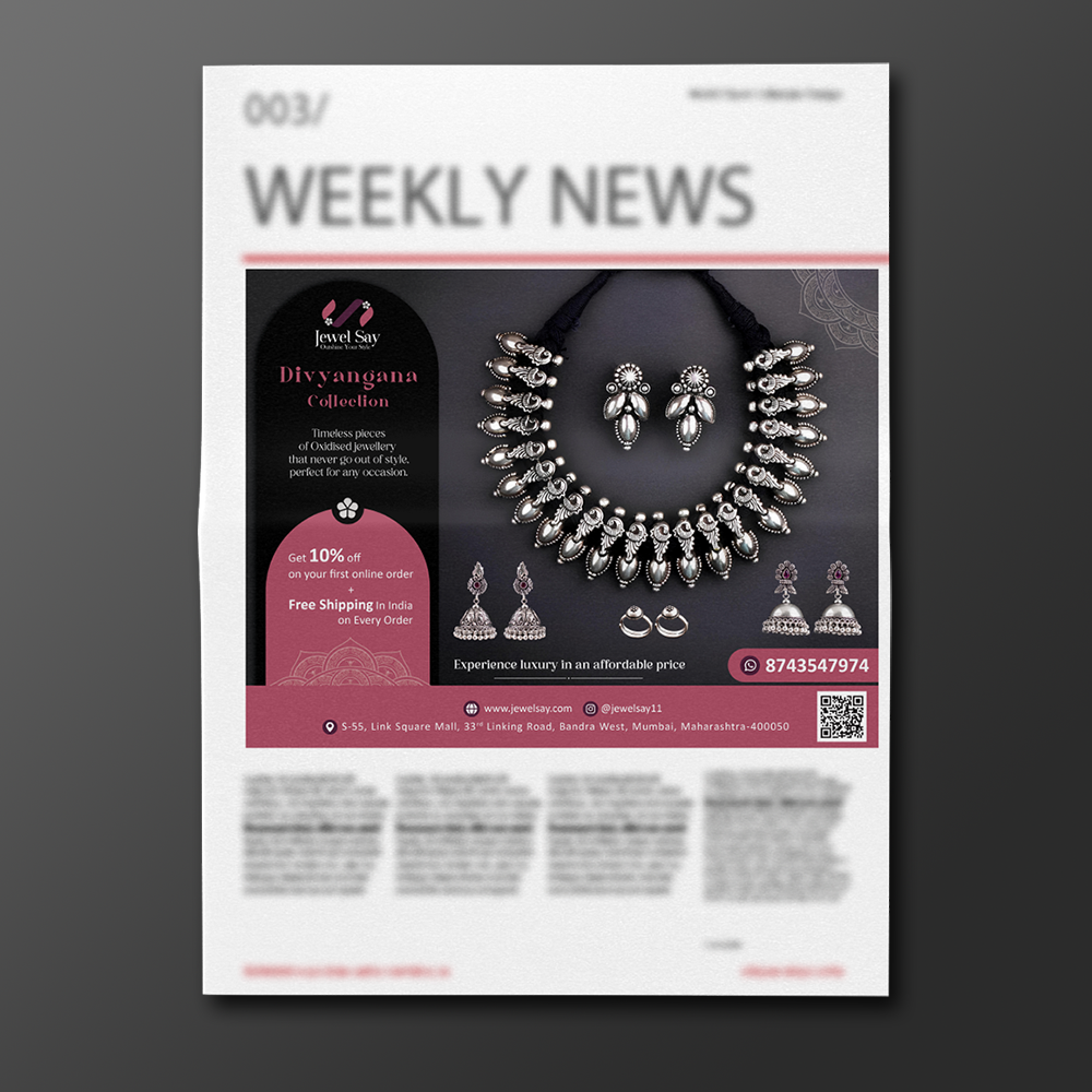
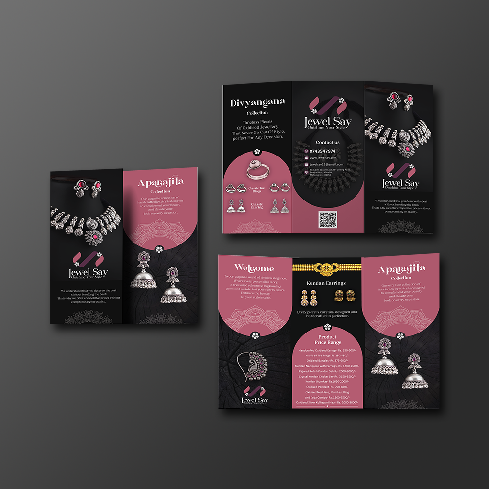
The Jewel Say logo is a captivating fusion of elegance, modernity, and sophistication, embodying the essence of our luxury jewelry brand. At the heart of the design lies a seamless integration of the letters “J” and “S,” forming a harmonious and distinctive symbol that represents the brand’s identity.
The incorporation of a delicate flower design within the logo symbolizes the exquisite craftsmanship and beauty of our jewelry pieces.
The intricate details of the flower serve as a subtle nod to the ornate nature of our collections, while also adding a touch of femininity and grace to the overall design.
The use of violet and hot pink colors evokes a sense of royalty, opulence, and contemporary flair. Violet symbolizes luxury, creativity, and mystique, while hot pink adds a touch of vibrancy, playfulness, and modernity to the design. Together, these colors create a captivating visual impact that resonates with our target audience.
Making Of Meal Movers
Brand Identity
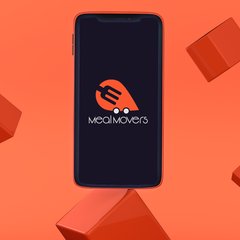
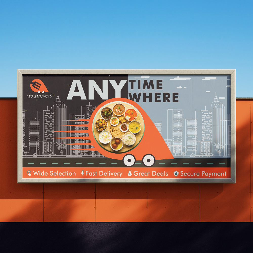
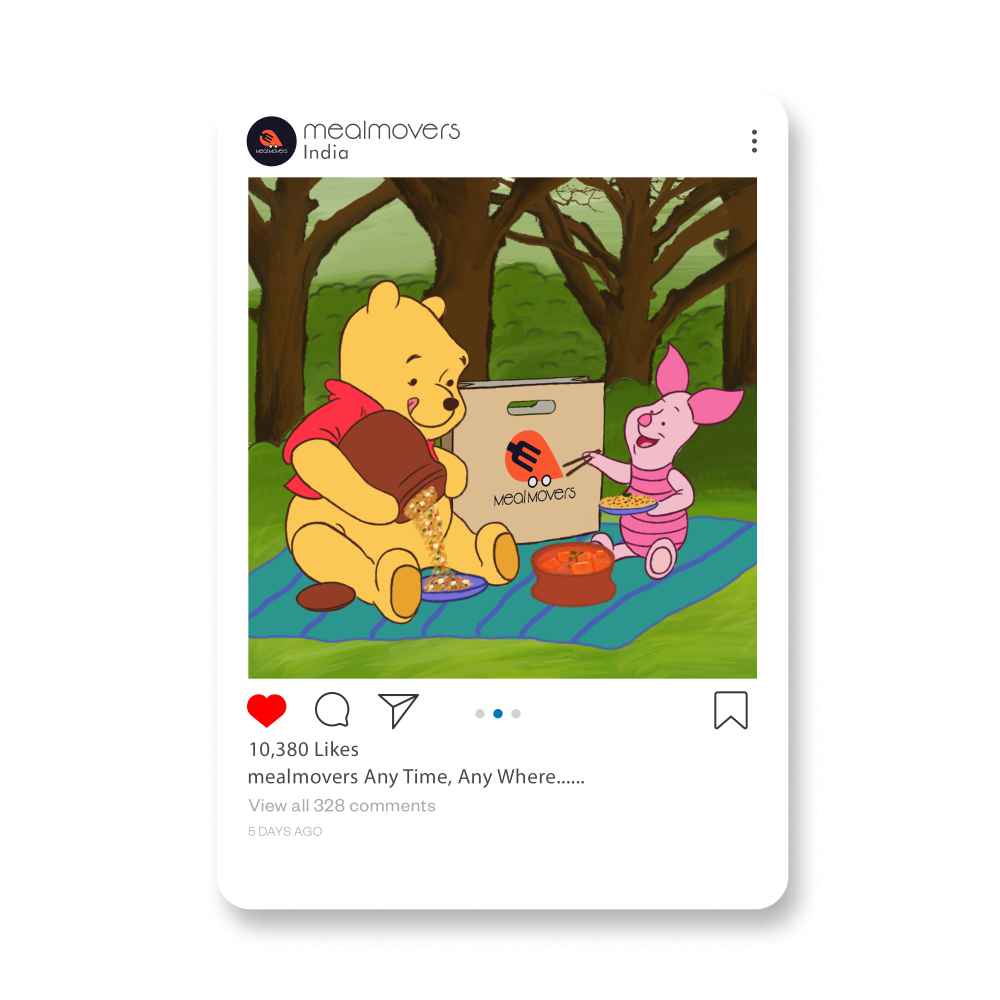
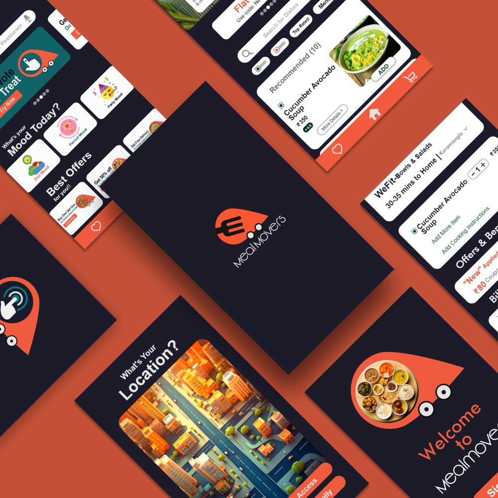
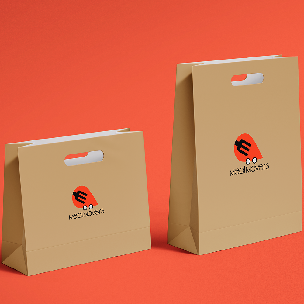
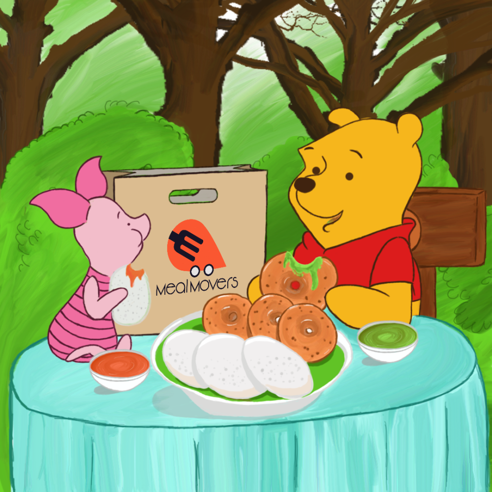
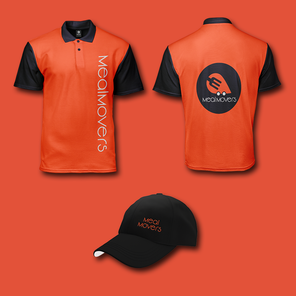
Our logo for Mealmovers is a bold and dynamic representation of our commitment to delivering delicious meals straight to your doorstep. At the heart of our logo is the letter “M,” cleverly crafted to resemble a fork, symbolizing both food and movement. The fork forms the foundation of our identity, highlighting our dedication to providing quality dining experiences.
Integrated seamlessly into the design is a location icon, slightly slanted to convey a sense of motion and speed. This icon represents our efficient delivery service, powered by cutting-edge technology and a fleet of dedicated vehicles. The addition of wheels to the location icon emphasizes our swift and reliable transportation, ensuring that your meals arrive fresh and on time.
The color palette of vibrant orange and dark blue further enhances our brand identity. Orange embodies energy, enthusiasm, and warmth, reflecting the excitement and satisfaction of enjoying a delicious meal. Dark blue adds a touch of professionalism and trustworthiness, instilling confidence in our customers and partners.

3D Modeling & Animation
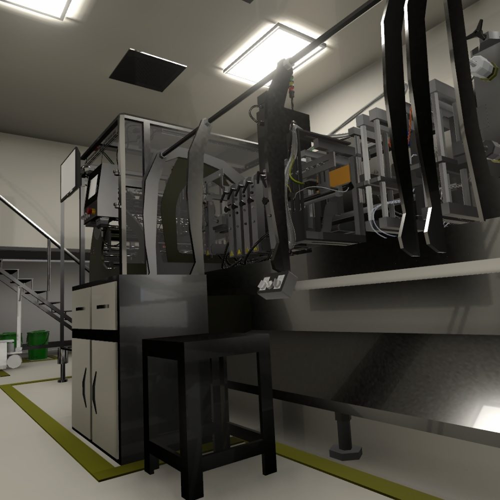

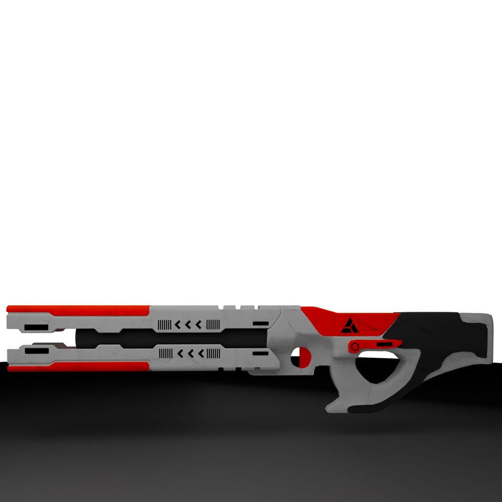
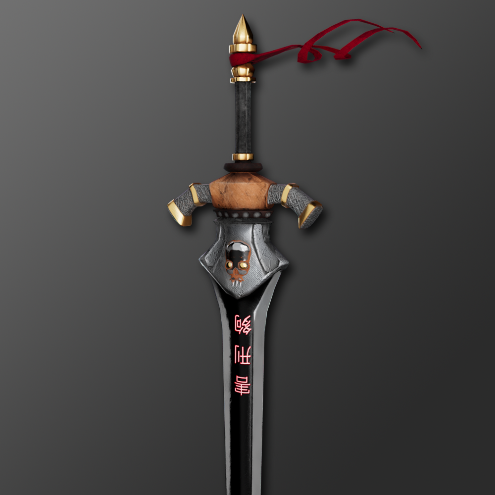
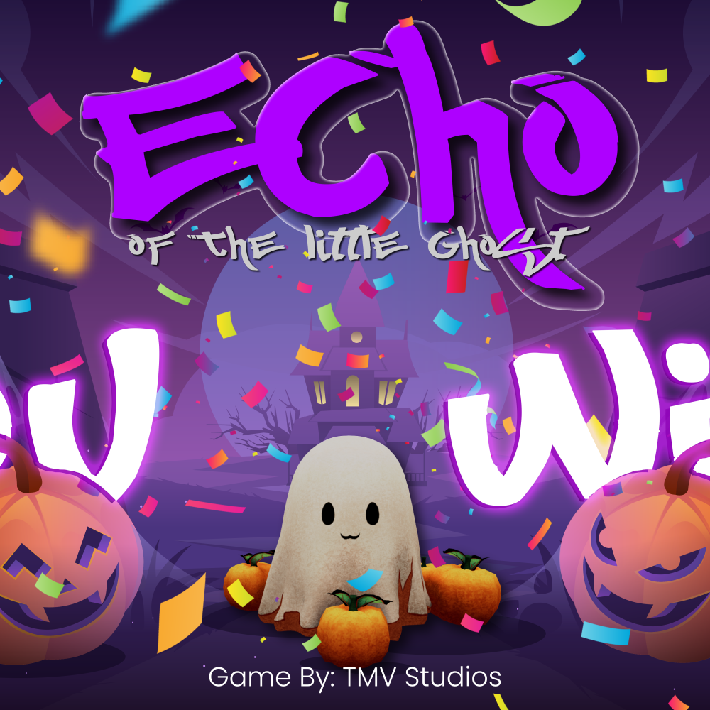
Game Design & Development
Connect
Got a Project?
Whether you need a brand that stands out, a product that sells, a website that works, or a game that captivates—TMVstudios is here to make it happen.
